
FEATURE10 January 2013

Internal data-sharing is one thing – but brands also have to communicate information to consumers. Betfair, Ford and Absolut discuss how they use data visualisation to engage the public.
Alasdair Wright, global head of customer marketing and loyalty, Betfair
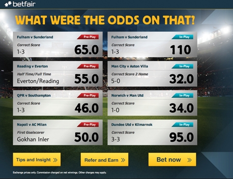
Data visualisations are a great way of driving marketing efforts, which enable customers to get the best out of their relationship with Betfair. In the bookmaker’s environment we are able to use complex event processing (CEP) technology to monitor and react to customer behaviour about major events on our website and on social media sites.
As our odds change, we use graphs to show the peaks and troughs of the day and explain all the significant happenings that are changing the value of a bet. We are able to visualise this by using the CEP to analyse events (fixtures information and user events such as bet placement and funds withdrawal) to detect patterns and extract data from them. We can then translate this into an illustration which is clear and simple. It works for us because it highlights our differences from our competitors, particularly in the value proposition. These visualisations directly play into our USP – namely that Betfair is one of the few companies to allow gamblers to bet at odds set by other users rather than by the bookmaker.
This is about bringing in the right customer who will be valuable for the long term. We’re not looking for one-off punters, but if we get people in at the start of the tournament they are more likely to stay with us longer. They enjoy these real-time visualisations, because they are empowering them to be in control and understand when is the right time to have a flutter.
It also enables us to spot any detail that would otherwise go missing such as the hottest parts of the website including banners and offers with high degrees of traction.
The ability to create, identify and curate content that is going to be interesting and carry across multiple channels is quite useful. As the internet and web-based content continue to grow at such a rapid pace, numeracy and the ability for a marketer to deal with huge amounts of data are vital. The ability to sort through all that and find the one thing that is going to make the difference, the one small change you make that could have a massive effect on the bottom line, is crucial.
Raj Nair, group vice president, global product development, Ford
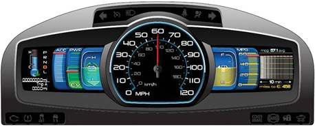
A great example of our use of data visualisation is our latest prototype dashboard concept developed with the Smart Design agency. The SmartGauge dash gives drivers a wealth of information in an enticing format without confusing or – worse – distracting them. We take the wealth of information coming from the vehicle and translate it for the user so that their drive becomes seamless. Complex graphs or fuel usage timelines were ignored in favour of iconographic alternatives: fuel gauges, for instance, are represented by an image of a tank filled with an oil-like yellow liquid.
User research discovered how some drivers get obsessed with achieving a ‘high score’ while driving – that is the lowest per-mile fuel usage. So fuel efficiency is represented by a rendering of curling vines blooming with green leaves. It’s more than a decorative element, though. It’s a data visualisation tool intended to change the way people drive. If a driver wastes gas by aggressively accelerating or slamming on the brakes, for example, the vine withers and leaves disappear. More leaves appear if individuals drive more economically.
What we need to remember is that data in its purest form is dull and not altogether useful to the everyday person. By visualising things in a different way, we are helping drivers get the most out of their vehicles and we are simultaneously learning new behavioural trends that will impact the next product development cycle. It’s win-win when it’s done neatly and is supported by the best data scientists.
Mark Hamilton, global marketing director, The Absolut Company
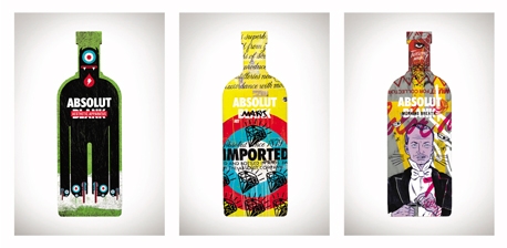
There is something very compelling about data visualisation as a vehicle for helping take your brand beyond being just one of a number of options in a competitive marketplace. Done right, it offers stakeholders an instant visual representation of your brand ethos. Our approach has seen us challenge artists to showcase a different side to our brand.
For me, this is the most important role that data visualisation must address. When we commission such projects, the brief is always to identify something that will make a consumer stop and consider what Absolut is all about and why it might be relevant to them. It doesn’t necessarily have to shout numbers or brand values, but it does have to have a distinguishing mark that makes people appreciate why they pay above average prices for our product.
We are constantly gathering intelligence from our consumers and suppliers to identify the different things our brand stands for within different customer segments. Our challenge to designers or digital enthusiasts is to take this pile of facts and find a
way to reinvent Absolut’s look and feel to strive to ensure that we continue to establish ourselves as a global brand icon. This is what all our stakeholders expect from us and offering them this instant visual read is what they want to see. All the words in the world wouldn’t have the same effect as an image that can be observed and understood.
By taking account of data and giving the artists our bottles as a blank canvas, we are inspiring people throughout the world to collaborate and fill them with creativity.
We brought together creative collaborators from a variety of disciplines and watched the journey from pure white canvas to exceptional pieces of art. What we get is not only concepts that have attention-grabbing cut-out imagery, colourful and playful graphic designs and bold illustrations imprinted on the bottle, but a visualisation that reflects what Absolut wants to be known as to our target audience. It’s much more interesting than sales data or company reports would ever be.

The world's leading job site for research and insight
Spalding Goobey Associates
Research Manager/Associate Director – Quantitative – Award Winning Insight Agency
£40–60,000 + bens
Resources Group
Associate Director – Finance / Auto
Up to £55,000 + Benefits
Spalding Goobey Associates
Research Manager – International Strategic Comms
£40–48,00+ bonus and benefits
-
Brought to you by:

©2024 The Market Research Society,
15 Northburgh Street, London EC1V 0JR
Tel: +44 (0)20 7490 4911
info@mrs.org.uk -
© Copyright 2024 Research Live
3 Comments
Stuart Knapman
11 years ago
Surely this is just 'visualisation' (or indeed 'good design') rather than Data Visualisation. You don't want Data Visualisation to become one of those nebulous catch-all terms like Behavioural Economics.
Like Reply Report
Anon
11 years ago
Have to agree with Stuart. What has Absolut's bottle design got to do with the specifics of Data Visualisation? There may have been some insight relating to brand associations that was used to inpsire the designs but this not how data visualisation is being defined. This article is simply daft!
Like Reply Report
Brian Tarran
11 years ago
Sorry you feel that way, 'Anonymous'. The brief for this piece was to look at how companies were taking some of the principles of data visualisation and data design and applying it to their customer-facing communications. Admittedly, it differs from how data vis is being applied internally, but the rest of the special report focused on that side of things. To address Stuart's point about data visualisation becoming a "nebulous catch-all term" – I think it already kind of is (although certainly not as much as the term 'infographic', which is applied to things that are in many cases more 'info' than 'graphic). Depending on who you speak to, data visualisation might mean pie charts and bar graphs or it might mean the more abstract, almost art-like interpretations of data. Our Data Vis Gallery, which goes live this afternoon, features a mix of both.
Like Reply Report